Adapted from Robert Harris’ bestselling novel, Edward Berger’s Conclave brings to light the inner workings of the Vatican when the College of Cardinals gather to elect a new pope. Overseeing the process, Cardinal Lawrence (Ralph Fiennes) must handle the private secrets and back-room conspiracies that could derail the process. With a supporting cast that includes John Lithgow, Stanley Tucci, and Isabella Rossellini, the movie is as suspenseful as it is surprising. Screen Daily writes, “Conclave offers the viewer an imagined, intimate peek inside an ancient institution undertaking one of its most secretive rituals.”
To create these spaces, the filmmakers turned to production designer Suzie Davies. In films from The Zookeeper’s Wife to Saltburn, Davies has earned a reputation as an imaginative designer of elegant, historical spaces. For Conclave, Arts Meme writes her “brilliant production design recreates the Sistine Chapel and other soaring Vatican rooms with an authenticity that renders these locations another potent character in this story.”
We spoke with Davies about recreating the Vatican, imagining its unknown spaces, and imbuing the location with mystery and intrigue.
Conclave is only in theaters October 25, so get tickets now!
The official trailer for Conclave
How did you get involved with working on Conclave?
I’d briefly worked with Edward [Berger] during lockdown on a production that never happened. When Conclave came up, Edward asked, "Hey, do you want to join this film? By the way, it's shooting in Rome." I was not going to turn down the opportunity to work in Rome for 6 months.
What excited you about the project?
The fact that Edward told me he wanted it to treat it like a thriller. It was not going to be a traditional movie about cardinals but something more like The Parallax View. I was envisioning wide-screen intrigue and business happening in hidden, dark corners. I loved that it was going to take a traditional story and turn it on its head.

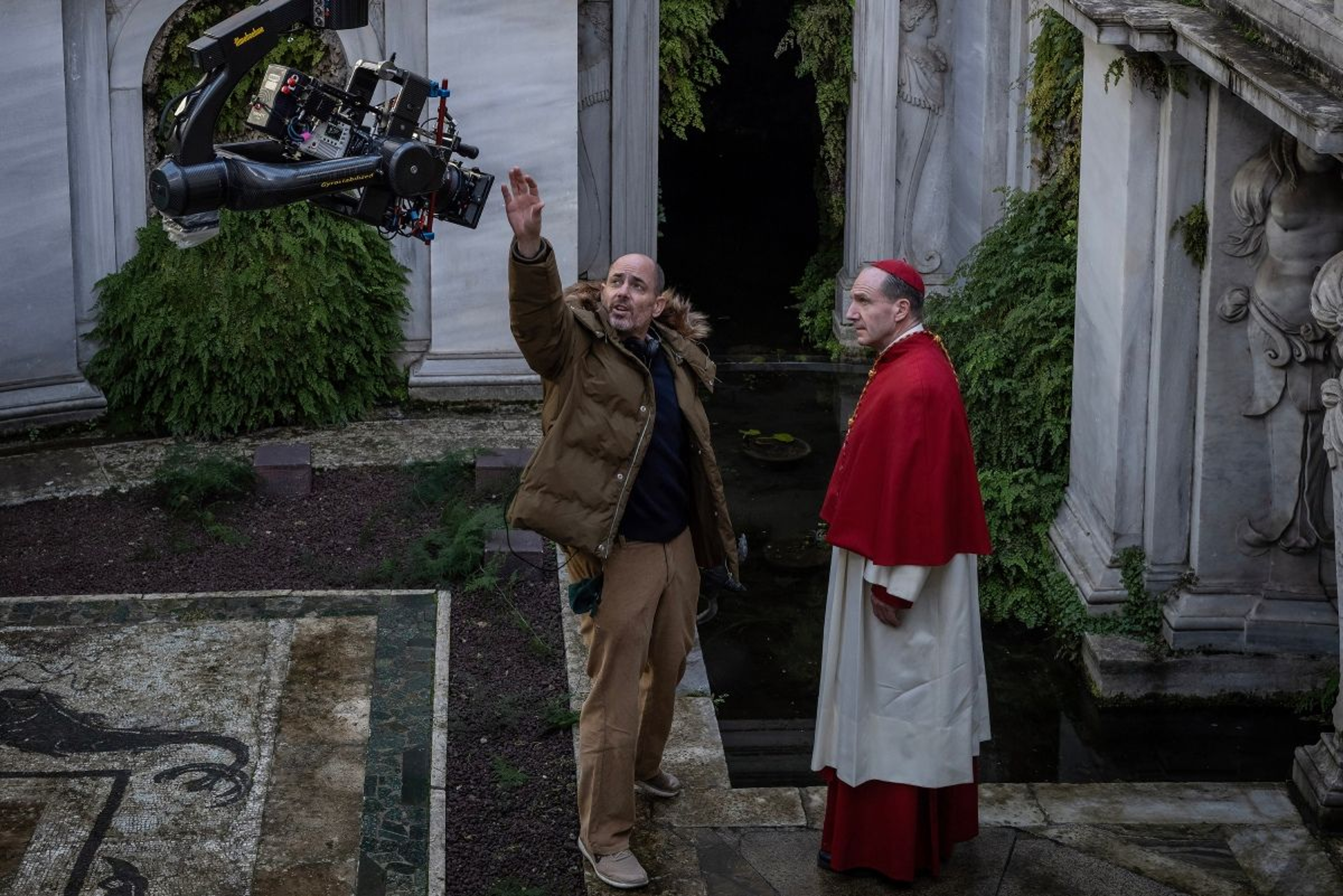
Edward Berger and Ralph Fiennes on the set of Conclave
How did you recreate the Vatican that people know and have visited?
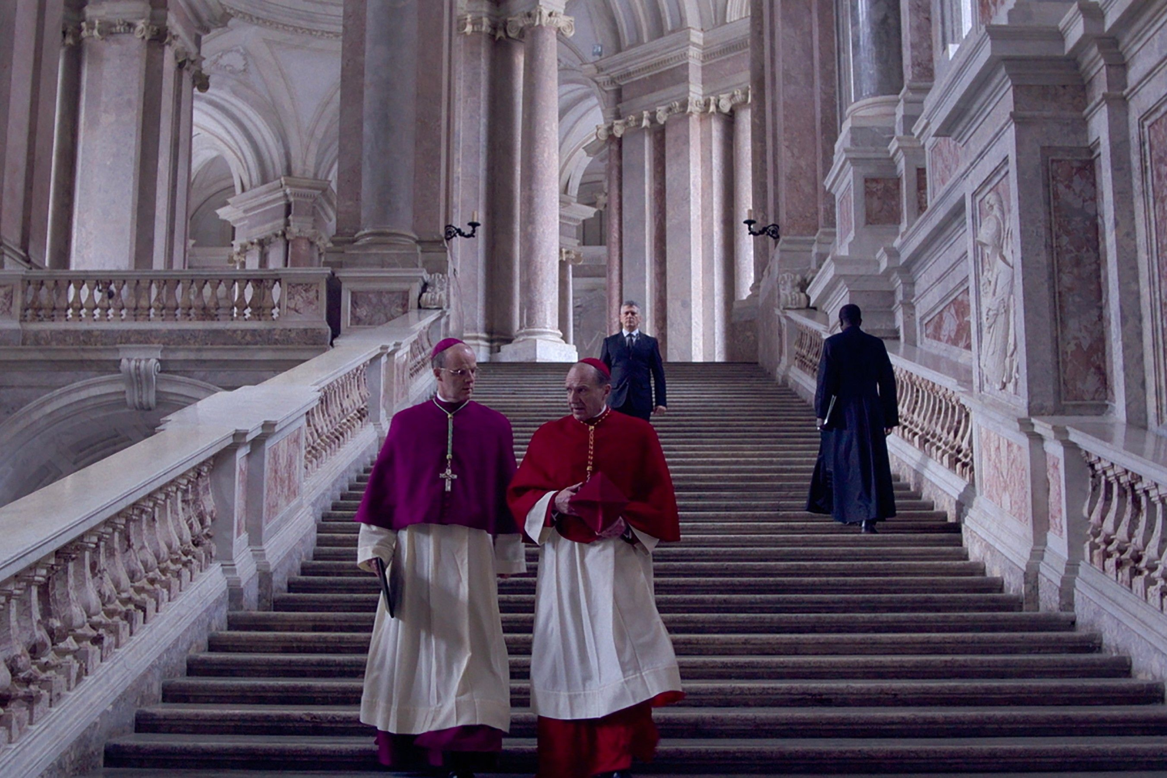
Like other people who go to Rome, we went on a tour of the Vatican to get a sense of the real place. Since we couldn’t film there, we had to figure out how to patch things together to create the look of the space. Rome has an extraordinary variety of churches, museums, and palazzos we can use. We wanted to juxtapose those familiar spaces of the Vatican with the spaces you don’t know, to balance those gilded, ornate spaces with contemporary architecture.
As much as we did our research on how the conclave works and the Vatican looks, we took artistic license with the private aspects of the Vatican to make a cinematic thriller. We found locations, like L'Ospedale di Santo Spirito, which is one of the oldest hospitals in the world, which had so many great features, like ancient corridors and courtyards with hidden library bookcases.
You recreated the Sistine Chapel for the film. How did you handle the other famous artwork there?
We had to get clearance to use the art in the Sistine Chapel, which weirdly isn’t actually owned by the Sistine Chapel but by a company that's not even Italian. As with any film, I have to get the artwork cleared or I have to make it bespoke. Where ever possible, we made artwork that was bespoke in the style of or inspired by rather than using, say, a real Leonardo.
How much did you use actual locations and how much was built in a soundstage?
It was about half and half. The Casa Santa Marta is a build. The Sistine Chapel is a build that has a set extension. Because it's so high, we couldn’t fit it in the studio. We used a blue screen for the ceiling and some of the windows. Other places were builds but on locations.

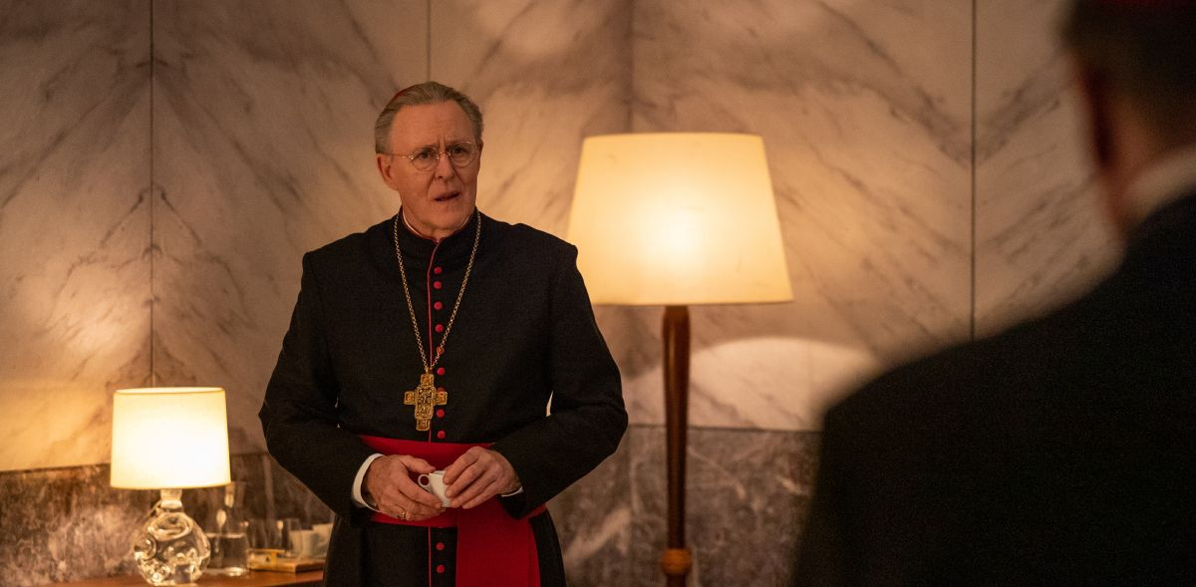
John Lithgow in Conclave
Can you talk about how you used contrast as a guiding style in the set’s design?
We tried to highlight contrasting values. For example, we knew the Cardinals would look extraordinary in their costumes, so to juxtapose their grandeur by seeing them on the phone smoking a cigarette or tucking into a bowl of pasta was powerful. For example, in the canteen scenes [where the Cardinals took their meals together], we wanted something that contrasted with the ceremony. The space is actually a military canteen that was falling down. When we found it, it was messy, dirty, and with all the wrong colors, but it had the right structure and a good ceiling. I wanted the ceiling to feel quite low like they are living in a bunker, especially since everywhere else is open with big, painted ceilings.
What was your most ambitious set?
You’d think it would be the Sistine Chapel, but actually it was the Casa Santa Marta [which is the residence hall for English-speaking priests]. I wanted the corridors to feel as long as possible so it was our biggest build. To handle the logistics, we built it right along the Sistine Chapel on the same stage. If you went through some of the doors in the Casa Santa Marta, you’d end up in the Sistine Chapel. It was like a massive jigsaw puzzle in which I ended up using every available space on that sound stage.
How did you create spaces that introduced the tone of a thriller?
Knowing that it was going to be in wide-screen, we tried to create pockets of light and dark in the composition. It was sort of playing with frames within frames, so we could separate out people and things when we wanted to. But it was all a collaboration. The sound design was brilliant in creating those echoey hallways, and the way Stéphane Fontaine, the DP, lit it, and those beautiful costumes—it all worked together.
Were their cinematic or photographic works that provided inspiration?
The American photographer Saul Leiter and his color palettes gave us the right vibe. And the photographer Vivian Maier, who took a lot of slightly hidden observational photographs, was useful. We wanted to create the same feeling you have in her work of being watched or people watching other people. The artwork of the time, like the play of light and dark in the paintings of Caravaggio, was also really helpful.
What do you hope audiences take away?
I hope people come out with an open mind about everything from religion to race to gender.
This interview has been edited and condensed for clarity.
