Lenny Abrahamson’s The Little Stranger, adapted from Sarah Waters’ haunting novel, revolves around the strange occurrences at Hundreds Hall, a once grand estate fallen into disrepair in post-war Britain. When Dr. Faraday (Domhnall Gleeson), a local physician who’d seen the house in its glory as a working-class lad, returns to Hundreds, he finds a building and its aristocratic owners in decline. Mrs. Ayres (Charlotte Rampling) and her adult children, Caroline (Ruth Wilson) and Roderick (Will Poulter), struggle to maintain their class legacy as a strange force within the house is tearing them apart. To transform the physical building into a dynamic character in the story, the filmmakers turned to production designer Simon Elliott. From the miniseries Bleak House—for which he won an Emmy for Art Direction—to the film The Iron Lady, Elliott demonstrates an uncanny vision for how to showcase historical periods. “He did an incredible job on the design,” exclaims Abrahamson, “giving it this very particular personality that is essential to the story.”
We spoke with Elliott about the architecture of haunted houses, capturing The Little Stranger’s historical period, and turning a building into an essential character.
What did you see as your biggest challenge in the production design for The Little Stranger?
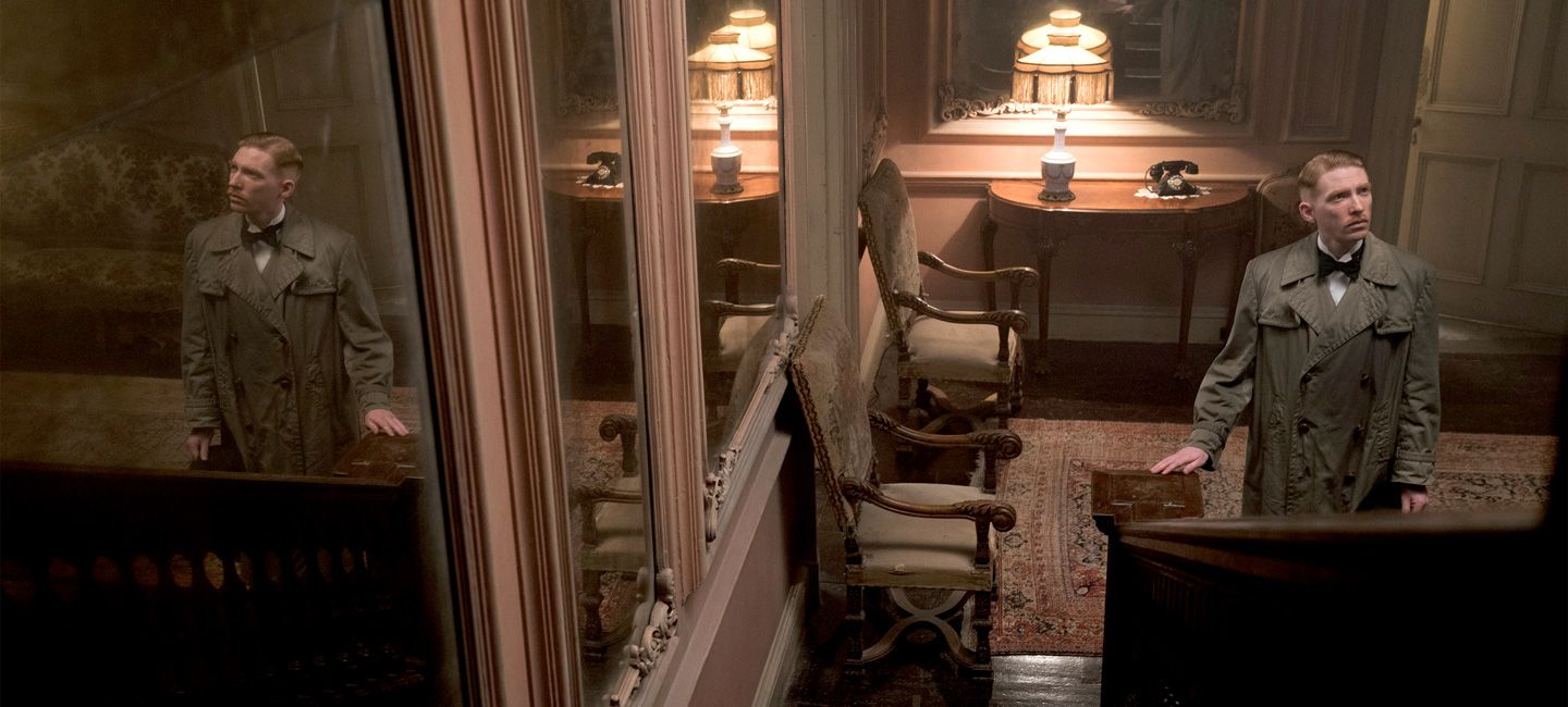
My initial response when reading the script was that I wanted to play against genre. The traditional idea of the haunted house is a dark and somber one, usually a brooding gothic mansion. I knew from the start I wanted to subvert that idea by doing the opposite in many ways. I liked the idea of having an architecturally simple house, which is why we ended up looking for something Georgian. There is a great tradition in grand English houses to use a pastel color palette and floral patterns. I thought it would be fun to explore the juxtaposition of playing this visually against the narrative of the haunted house. In many ways, some of the most chilling rooms are its prettiest. I like the tension this creates.

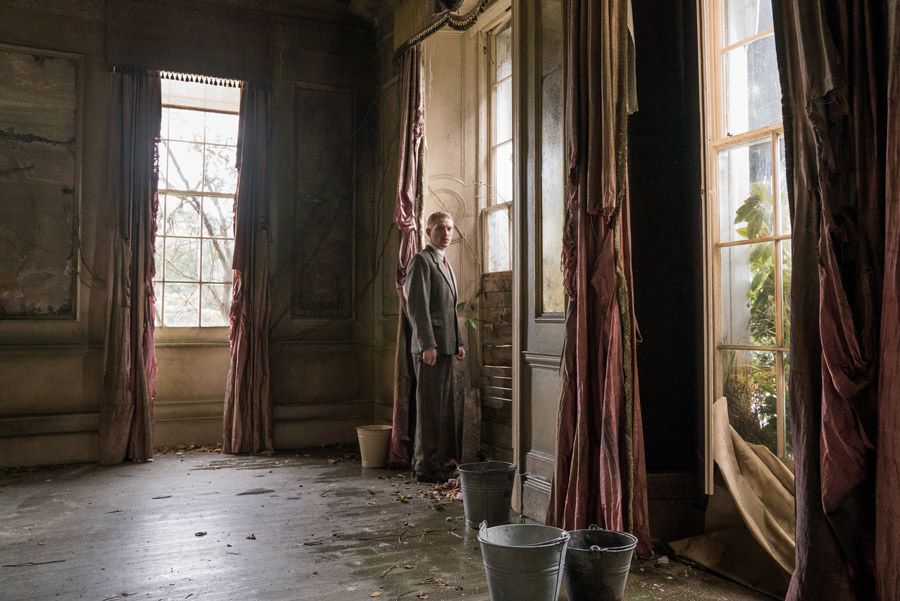
Dr. Faraday (Domhnall Gleeson) in Hundreds Hall in its decline in The Little Stranger
Abrahamson talks about the house as being a character in the film. How did you suggest that in the design?
It was very important that the house feel like it had lived a long, layered life, that it had as much of a story to tell as the characters that inhabited it. It is a house in decline, but I very much wanted the audience to see what it once could have been by evoking an English country garden as the summer ends—the colors fading, the flowers long past their prime, and the chill of autumn in the air.
The historical period is crucial to the story. How did the design showcase post-war economic changes?
To feel Hundred's decline was vital. So many great estates fell into ruin post WWII. With little income and often saddled with death duties, owners of these houses struggled to keep up with the running costs. Slowly over time their prized possessions where sold off to provide much needed funds. The make-do and mend attitude of the war era prevailed. I tried very much to show this in the design. Walls have been stripped of paintings. Display cabinets are empty. There is a random displacement of furniture and objects, and damage is left unrepaired. There are rooms that are no longer used and the family retreats into ever-smaller rooms they can heat.
"It was important for me to have a building that gave me the freedom to create a complete visual language for the house's interiors."
What sort of historical research did you do for the film?
I did a lot of reading and photographic research on the period to find out what happened to a lot of these great estates. I learned how many were requisitioned during the war, used for hospitals and barracks and then handed back to their owners a shadow of their former selves
What were the most important elements for any building you chose for Hundreds Hall?
The challenge in finding the house was to find a space that allowed Lenny the freedom of movement. It was important for him that the camera be allowed to flow through the interior of the house. This meant that choosing a series of houses and stitching various rooms together was not going to work for us. The connective spaces were as important as the individual rooms. It was important for me to have a building that gave me the freedom to create a complete visual language for the house's interiors. We were lucky to find Langleybury House, which is an old, semi-derelict house with a similar history to Hundreds Hall. Once there, I was allowed pretty much [to] do what I wanted to its interior. We did a complete refurbishment, including knocking down walls.
To capture Hundreds Hall in its glory and decline, you had to find two different buildings. How did you blend them together?
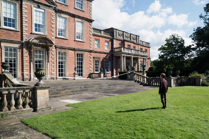
We needed to see the exterior of Hundreds in its prime. We had been discussing how to achieve this when I was lucky enough to stumble over a newspaper article about the struggles of maintaining large estates. To my surprise, the photograph which accompanied the article was a picture of Newby Hall and its magnificent gardens. It was an almost exact match to Langleybury. This enabled [us] to use different aspects of both houses to reflect Hundreds Hall in the different periods [of] time and to better show its decline. The back of Newby and its beautiful lawn serves as Hundreds in 1919 while Langleybury is both the front and the forlorn side garden for post-war Hundreds Hall.

The back of Newby Hall doubles as Hundreds Hall in its glory
The film suggests, but never shows, that the house might be haunted. How did your designs create that feeling?
To support the idea that the house is haunted I knew I wanted it to feel empty. With the house devoid of its clutter, I hope the audience sees and feels the house rather than be distracted by the items in it.
Sign up for the Focus Insider newsletter to be first in line for free advance screenings, world premiere travel packages, weekend set visits, and so much more!
