Staging The Battle For Chicago: Designing Captive State
A Q&A with production designer Keith P. Cunningham
Rupert Wyatt’s Captive State—now in theaters—unfolds in a Chicago that has been under alien occupation for the last nine years. Some citizens, like ex-cop William Mulligan (John Goodman), try to keep the peace by working for the collaboration government. Others, like Rafe (Jonathan Majors), fight back as part of the resistance. With few good options available, many citizens, like Gabriel (Ashton Sanders) and his best friend Jurgis (Colson Baker), just look for a way to escape. To make this hard-hitting futuristic film feel like a world we know, Wyatt turned to production designer Keith P. Cunningham. Having worked with Cunningham on his crime drama The Gambler, Wyatt trusted him to find architectural spaces that reflected the complex emotional state of this occupied city. A native of Chicago, Cunningham scoured the city to secure unique locations, places that both chronicled the devastation of the last nine years and sparked some hope for the future.
We spoke with Cunningham about turning his hometown into an occupied territory, letting the locations tell a history of aliens, and finding hope as the film’s ultimate message.
The official trailer for Captive State
How did you get involved doing the production design for Captive State?
Having worked with Rupert before, we had a nice collaboration. He told me he had this original lo-fi, sci-fi story, which he had come up with his wife Erica Beeney about an alien occupation. It was a great read and a wonderful opportunity design-wise.
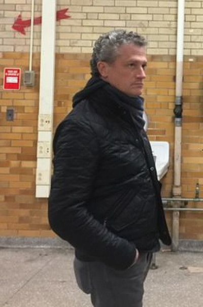
Production designer Keith P. Cunningham on set
How did you envision the world in which Captive State takes place?
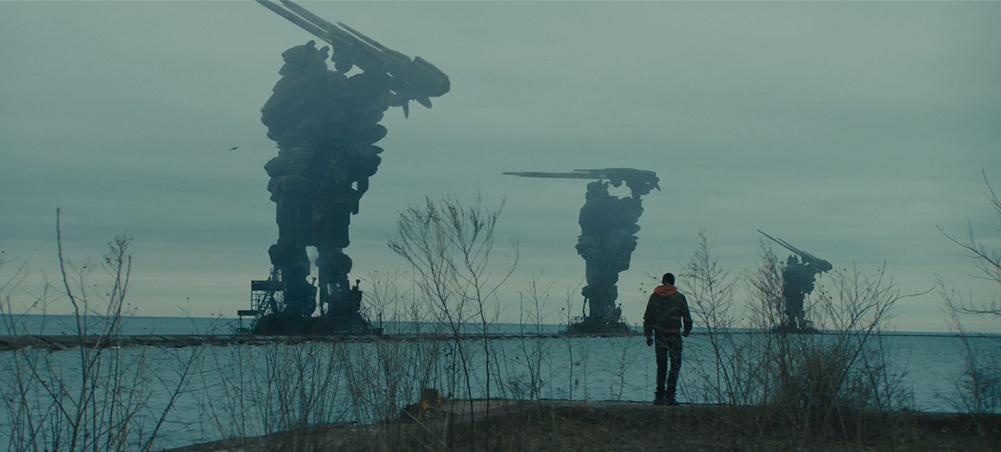
The movie starts nine years into the occupation. To imagine what had happened, we created a backstory about how when the aliens came, they were so powerful and overwhelming that the government just capitulated. There was no apocalyptic battle or widespread destruction like we’ve seen in other sci-fi films. We imagined that part of Chicago had turned into a sort of ghetto, run-down and gritty. During this occupation, the city’s infrastructure has fallen apart. The aliens, who we rarely see, are bleeding the city dry. We wanted to highlight in the design how this affected people. The aliens control the power grid, and electricity is unpredictable and in many places unattainable. People have to make do with what they have. We designed the sets to show how people powered their own homes, cobbling together car batteries and using sunlight. The interior details showed how rough life had become.
What did you see as the film’s biggest creative challenge?
The way Rupert wrote it, the film has a hyper-kinetic narrative. We were constantly on the move with the characters throughout. So the big creative challenge right out of the gate was scope. There were so many physical sets and locations. We were constantly moving through alleys, up stairways, across rooftops, and in tunnels. We adopted a very linear approach in terms of scope for how the characters needed to move through the city.
As a Chicago native, did you have an insider’s knowledge of where to find unique locations?
Yes. Having grown up and lived there until I went to college, I knew there were particular areas that felt really stuck in time. They have the characteristics and architecture of a different era, which is what we were looking for. We wanted locations that could put forth the idea that humanity had not moved forward since the occupation, that it was stuck. We landed on a part of town called Pilsen. It had a great labyrinthian feel with a network of alleys and backstreets that connect all the storefronts and apartment buildings. Also it worked because Rupert and I were really leaning towards finding brick structures as opposed to wood. It enhanced our color palette, which was mostly in earth tones. We wanted that gray, overcast feeling.
Many of your locations seem to frame Chicago’s downtown and its skyscrapers in the background.
We used a lot of abandoned structures and run-down facilities with graffiti to provide texture and contrast. At each location, we looked for an angle that would allow us to see the Willis Tower downtown in the distance. In this world, there is a distinction between where the haves—the people who collaborate with the aliens—and the have-nots live. The haves live in a shinier part of the city downtown. That is the area the resistance wants to attack.
We wanted locations that could put forth the idea that humanity had not moved forward since the occupation, that it was stuck.
How did you work with the effects team to imagine the parts of Chicago that the aliens have destroyed?
In the film, there is a legend about something having happened at Wicker Park (another neighborhood of Chicago), about an earlier uprising that didn't go well. Supposedly aliens decimated that part of town. At one point, Ashton's character discovers for himself that the story was true, that part of the city had been destroyed. To show this, we looked at references from places like Syria and other war torn areas and created illustrations and concept boards for the effects team to work from.
While the film is very realistic, you also have some more traditional sci-fi elements.
There is an alien sci-fi part, but we didn't want to go in for the shiny flying saucer kind of thing. In showing the alien species, for example, we really wanted to ground the physicality of them. We landed on them being sort of insectoid beings. As for the humans, there is not a lot of technology for them to use. Since the occupation, all humans have been implanted with this tracker so they can be surveilled. These spooky drones floating everywhere track everyone and alert the authorities if something is off. To avoid detection, the resistance cobbles together a rough technology. For example, they create collars that can block the tracker signals. Overall we wanted to keep those sci-fi elements peripheral to the main drama.
Were there cinematic references that helped you imagine this world?
Rupert has an encyclopedic mind for film so he brought a lot of references to illustrate what he was looking for. We looked at Andrei Tarkovsky’s Stalker and [Denis Villeneuve’s] Arrival—which had just come out when we were in pre-production. District 9 had that gritty sci-fi/not sci-fi feel we were interested in. Rupert also talked about this as a sci-fi version of The Battle of Algiers, especially in the way that we always keep the camera inside the characters’ perspective.
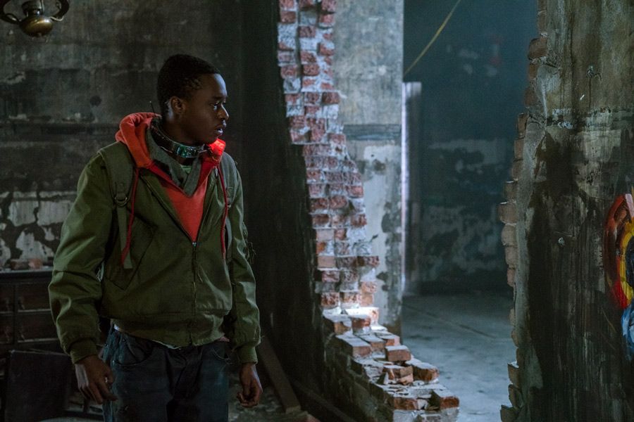
Ashton Sanders in Captive State
While the exteriors are gritty and cold, you give the humans’ home a sense of security and domesticity.
We really wanted the interiors to play against the exteriors. The exteriors have been completely neglected. There's no trash pickup. There's no sanitation department. Everything is crumbling. On the inside, however, people are hanging onto their domestic lives as best they can. We brought color to those scenes. The cinematographer Alex Disenhof, Rupert, and I came up with a palette of blues and reds for the interiors to give a layer of hope. The one color we didn’t use was yellow. We reserved yellow only for the scanning devices the people had to go through when they enter or exit a public building.
What do you want people to take away from the film?
Hope. I’d like people take away hope—for being able to take a stand, for keeping your spirit up even in the darkest of times.
Sign up for the Focus Insider newsletter to be first in line for free advance screenings, world premiere travel packages, weekend set visits, and so much more!